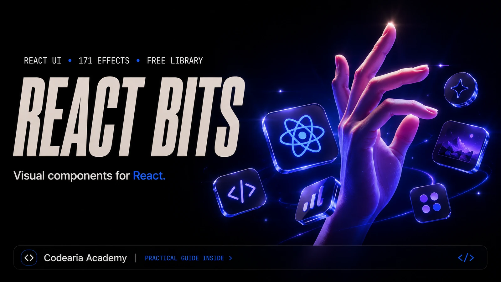
React Bits: the best visual component library for React in 2026
171 ready effects: shader backgrounds, three-dimensional galleries, text that answers the cursor. One command to install, free. We have run it in production for over a year and recommend it.
In this article8
Tools used in this piece
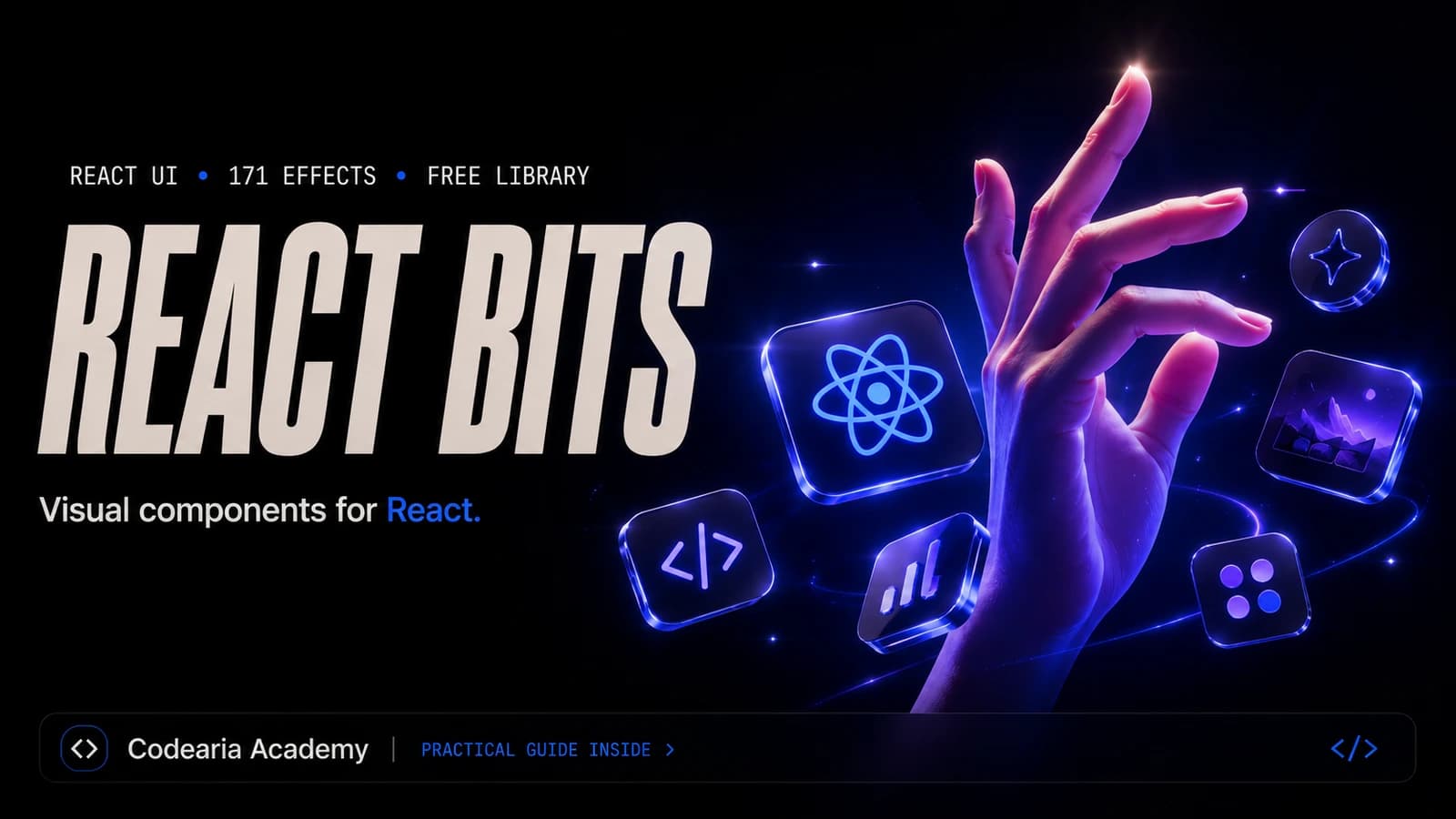
React Bits is an open catalogue of animated React components: shader backgrounds, text effects, three-dimensional galleries, menus and cards. As of 2 September 2026 the free library holds 171 components. It is not an npm package: a component installs with `npx shadcn@latest add https://reactbits.dev/r/Aurora-TS-TW` and lands in your project as an ordinary file you then edit as your own. Every component ships in four variants: JavaScript or TypeScript, plain CSS or Tailwind. The licence is MIT with the Commons Clause, so use in your own and client projects is fine. We have kept eight of its components in production for over a year and consider it the best catalogue of visual React components in 2026.
Some sites are impossible to fault and impossible to look at. Everything is in place: the grid is even, the typeface is decent, the spacing has been thought about. And the page still reads as a template, because nothing on it happens.
Between "fine" and "look at that" there are usually a few weeks of shaders, GSAP and Three.js. React Bits removes those weeks. It is an open catalogue of visual components for React where the effect is already written, already debugged, already tuned, and your job is to pick one and run a single command. If the first screen wants depth rather than a flat animation, the shelf next to it holds ready-made three-dimensional scenes.
I have used this library for over a year on real client work, and in its category I have not found anything better. Eight of its components run on this very site, including the background behind the text you are reading. So: what is in there, what it looks like, and what to know before you install it.
Backgrounds that rescue the first screen
The strongest part of the catalogue. Fifty-six backgrounds, nearly all of them drawn by shaders, which means the GPU does the work and the weight is nothing next to video.
Next to them sit Galaxy with its star field, Threads with drifting strands, Dither with retro grain, plus Plasma, Lightning, Hyperspeed and Balatro. The names do the explaining, and that is half the value of the catalogue: you arrive not for an abstract "animation" but for the exact effect you saw somewhere and spent half a day working out how to rebuild.
Every background has a live preview on the site and a panel of controls: colours, speed, intensity, noise. Move the sliders, watch the result, take the finished values into your code.
Components worth the visit on their own
Backgrounds catch the eye first, but the interesting part is the Components section. It holds the things people usually assemble by hand over two days.
The same shelf holds a macOS-style Dock, a Spotlight Card with a highlight that tracks the mouse, Card Swap with its deck of cards, Flying Posters, Circular Gallery, Staggered Menu, Profile Card and a Stepper for multi-step forms. Forty-five of them, and they are working parts of an interface rather than decoration.
Text that stops being just text
Thirty-two effects for typography alone. Split Text scatters a heading letter by letter as it appears, Decrypted Text resolves a line out of random glyphs, Count Up rolls numbers, Shiny Text sweeps a metallic highlight, Scroll Reveal brings a paragraph up as you scroll.
If you are opening the library for the first time, start here. A text animation on the first heading changes how the page feels in fifteen minutes, weighs almost nothing and works everywhere. Backgrounds are prettier, but they charge you in attention to detail, and that comes below.
One command, and the code is yours
React Bits works the way shadcn does: nothing goes into package.json. The site serves a registry, the CLI copies the component's source into your folder.
npx shadcn@latest add https://reactbits.dev/r/Aurora-TS-TW# the same thing through jsreponpx jsrepo@latest add https://reactbits.dev/r/Aurora-TS-TW
The TS-TW suffix picks the variant. Every component exists in four: JS with plain CSS, JS with Tailwind, TypeScript with CSS, TypeScript with Tailwind. What arrives is built for your stack instead of dragging somebody else's styling system along with it.
A component that arrives as a file is edited like your own: change props, cut what you do not need, add the thing the author never considered. The trade is honest. Updates will not arrive on their own, and a newer version means installing it again and re-applying your edits by hand.
There is a mode for people working with an AI agent, too. Add the registry to components.json, run npx shadcn@latest mcp init --client claude, and Claude Code searches the catalogue and installs components itself. Ask for "put a ray background on the hero" and you get an installed component instead of a link to the docs.
What we run ourselves
Eight of its components are live on this site. ColorBends flows behind the first screen with CurvedLoop running above it as a curved marquee, the buttons are SpecularButton, the work gallery is AccordionGallery. Aurora is the background on our get-started page and inside the guides, Particles live there too, Stepper walks people through steps, and Galaxy turns inside the modal that hints at scrolling.
Not one of them stayed as it shipped, which is normal work with someone else's code. ColorBends on the landing page carries hidden md:block, because a phone has no use for that shader at any price. Another fix of the sort you cannot google: ColorBends adds the colours of its bands rather than blending them, so three saturated colours blow out to white where they cross. We picked three deep, closely related tones (#6d28d9, #1d4ed8, #c2410c) and the sum stayed in the blue-violet range of our mark. Half an hour of tuning, and the component reads as ours rather than as something off a shelf.
The one thing you cannot skip: WebGL
The good-looking backgrounds are shaders. The first import inside Aurora is ogl, a light wrapper over WebGL, and some components pull in three. On mount, a component like that quietly asks the browser for a graphics context.
The trap is that "this browser does WebGL" and "this browser will hand over a context" are different statements. The context fails when hardware acceleration is off, when there is no working driver, when the person is on a remote desktop, when the tab has already opened too many contexts. A check like 'WebGLRenderingContext' in window passes happily while getContext returns null or throws. You will not see the error. A share of your visitors will, and to them it looks like a black hole where the background belongs.
The cure is a probe that genuinely tries to create a context and releases it immediately. Ours lives in src/lib/hooks/useGraphicsCapabilities.ts:
export function detectWebGLSupport(): boolean {
  if (typeof window === "undefined") return false;
  if (probeResult !== null) return probeResult;

  let gl: RenderingContext | null = null;
  try {
    const canvas = document.createElement("canvas");
    gl =
      canvas.getContext("webgl2") ??
      canvas.getContext("webgl") ??
      canvas.getContext("experimental-webgl");
  } catch {
    gl = null;
  }

  (gl as WebGLRenderingContext | null)
    ?.getExtension?.("WEBGL_lose_context")
    ?.loseContext();

  probeResult = gl !== null;
  return probeResult;
}
The probe context is released straight away, otherwise it occupies one of the few available slots and the real background may not get one. The result is cached, because a page often carries several such components. Until the probe has run the state is null rather than false, and the component draws nothing, which keeps the server markup and the first client render identical. Add prefers-reduced-motion in the same place: if someone asked their system for less motion, there should be less motion, whatever their GPU can do.
The rule is simple
Every WebGL component needs a static fallback: a gradient, an image, a plain colour. Show it while the probe runs, and keep it forever when there is no context. A page without shaders then looks plainer, not broken.
Catch the webglcontextlost event as well. A context can be taken away mid-session when the system runs short of memory, and without a handler the animation simply freezes.
What it costs
Nothing. The site says FREE FOREVER on the homepage, and the free library is not cut down into a demo. The licence is MIT + Commons Clause: use it in your own and client projects, commercial ones included, but do not sell the library itself as a product. For ordinary work the restriction never shows up.
React Bits Pro exists separately: page blocks, application screens and templates, one payment. We have not bought it, so I have no verdict to give. If you are not on React, there are official ports for Vue and Svelte.
Next step
Building a landing page from the first prompt to a published site: the terminal, ready-made components, and how to get an agent to install them for you.
Open the courseWho I recommend it to, and who I do not
Recommended if you are on React or Next.js and the task sounds like "the site is fine but nobody looks at it". This is the shortest route from fine to memorable that I know of. Start with a text animation on the heading, add one background after that, and always wrap the background in a WebGL check with a static fallback.
Not recommended in two cases. If the project runs on a strict performance budget where every kilobyte of JavaScript is counted, shader backgrounds have no place there. And if what you need is a design system with forms, tables and accessibility built in, that is the job of shadcn/ui or Radix. React Bits answers a different question, which is exactly where its strength is.
Numbers and versions move
Component counts, CLI commands and Pro terms are as of 2 September 2026. The catalogue grows weekly, so check reactbits.dev for current figures and the licence text.

Comments